In this tutorial, we’ll create a responsive blog section using Bootstrap 5. You’ll learn how to design a blog section with images and a sidebar.
Starting Bootstrap 5 Structure with CDN
<!doctype html>
<html lang="en">
  <head>
    <meta charset="utf-8">
    <meta name="viewport" content="width=device-width, initial-scale=1">
    <title>Bootstrap 5 Blog Section </title>
    <link href="https://cdn.jsdelivr.net/npm/bootstrap@5.2.3/dist/css/bootstrap.min.css" rel="stylesheet" integrity="sha384-rbsA2VBKQhggwzxH7pPCaAqO46MgnOM80zW1RWuH61DGLwZJEdK2Kadq2F9CUG65" crossorigin="anonymous">
  </head>
  <body>
    <script src="https://cdn.jsdelivr.net/npm/bootstrap@5.2.3/dist/js/bootstrap.bundle.min.js" integrity="sha384-kenU1KFdBIe4zVF0s0G1M5b4hcpxyD9F7jL+jjXkk+Q2h455rYXK/7HAuoJl+0I4" crossorigin="anonymous"></script>
  </body>
</html>
Get started by setting up a container, arranging your layout with rows and columns, and using Bootstrap’s cards for presenting blog posts.
<div class="container my-5">
    <h2 class="text-center mb-4">Blog Posts</h2>
    <div class="row">
        <div class="col-md-4 mb-4">
            <div class="card">
                <img src="http://via.placeholder.com/640x360.png" class="card-img-top" alt="image">
                <div class="card-body">
                    <h5 class="card-title">Post Title 1</h5>
                    <p class="card-text">This is a short summary of the blog post. It shouldn't be too long, just a
                        teaser.</p>
                    <a href="#" class="btn btn-primary">Read More</a>
                </div>
            </div>
        </div>
        <div class="col-md-4 mb-4">
            <div class="card">
                <img src="http://via.placeholder.com/640x360.png" class="card-img-top" alt="image">
                <div class="card-body">
                    <h5 class="card-title">Post Title 2</h5>
                    <p class="card-text">Another teaser of your engaging blog post goes here. Keep it short and sweet.
                    </p>
                    <a href="#" class="btn btn-primary">Read More</a>
                </div>
            </div>
        </div>
        <div class="col-md-4 mb-4">
            <div class="card">
                <img src="http://via.placeholder.com/640x360.png" class="card-img-top" alt="image">
                <div class="card-body">
                    <h5 class="card-title">Post Title 3</h5>
                    <p class="card-text">This is a snippet of what your audience can expect from this post.</p>
                    <a href="#" class="btn btn-primary">Read More</a>
                </div>
            </div>
        </div>
    </div>
    <div class="row mt-4">
        <div class="col text-center">
            <a href="#" class="btn btn-outline-primary">Load More Posts</a>
        </div>
    </div>
</div>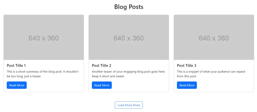
Bootstrap 5 Responsive Blog Section with Sidebar
Set up a blog section with a sidebar in Bootstrap 5. On large screens, use an 8-column layout for the main content (col-lg-8) and a 4-column layout for the sidebar (col-lg-4). On smaller screens, the blog area spans the full width (col-12), and the sidebar moves below the blog posts.
<div class="container py-5">
    <div class="row">
        <div class="col-12 col-lg-8">
            <div class="mb-4">
                <h2 class="display-6">Short heading goes here</h2>
                <p class="lead text-muted">Lorem ipsum dolor sit amet, consectetur adipiscing elit.</p>
            </div>

            <!-- Blog Entry -->
            <div class="card mb-4">
                <div class="card-body">
                    <h5 class="card-title">Blog Title Heading 1</h5>
                    <p class="card-text">Some quick example text to build on the card title and make up the bulk of the
                        card's content.</p>
                </div>
                <div class="card-footer text-muted">
                    11 Jan 2024 • 5 min read
                </div>
            </div>
            <div class="card mb-4">
                <div class="card-body">
                    <h5 class="card-title">Blog Title Heading 2</h5>
                    <p class="card-text">Some quick example text to build on the card title and make up the bulk of the
                        card's content.</p>
                </div>
                <div class="card-footer text-muted">
                    11 Jan 2024 • 5 min read
                </div>
            </div>
            <div class="card mb-4">
                <div class="card-body">
                    <h5 class="card-title">Blog Title Heading 3</h5>
                    <p class="card-text">Some quick example text to build on the card title and make up the bulk of the
                        card's content.</p>
                </div>
                <div class="card-footer text-muted">
                    11 Jan 2024 • 5 min read
                </div>
            </div>

        </div>

        <!-- Sidebar -->
        <div class="col-12 col-lg-4">
            <div class="mb-4">
                <h4 class="display-6">Sidebar</h4>
                <p class="lead text-muted">Sidebar content goes here.</p>
            </div>
            <div class="card mb-4">
                <div class="card-header">
                    Widget Title
                </div>
                <ul class="list-group list-group-flush">
                    <li class="list-group-item">An item</li>
                    <li class="list-group-item">A second item</li>
                    <li class="list-group-item">A third item</li>
                </ul>
            </div>
        </div>
    </div>
</div>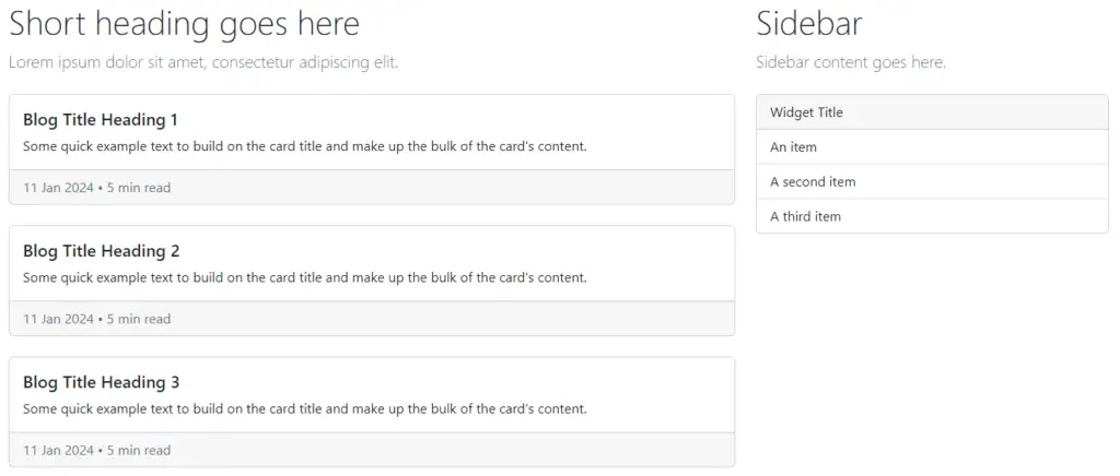
Bootstrap 5 Responsive Blog Section with Image
Create a responsive blog section with images using Bootstrap 5 to your website content presentation.
<div class="container py-5">
    <div class="row mb-4">
        <div class="col-lg-12 text-center">
            <h2 class="display-6">Short heading goes here</h2>
            <p class="lead text-muted">Welcome to the placeholder text, where words assemble for purely illustrative
                purposes.</p>
        </div>
    </div>
    <div class="row row-cols-1 row-cols-md-3 g-4">
        <div class="col">
            <div class="card h-100">
                <img src="http://via.placeholder.com/640x360.png" class="card-img-top" alt="image">
                <div class="card-body">
                    <h5 class="card-title">Blog title heading will go here</h5>
                    <p class="card-text">Welcome to the placeholder text, where words assemble for purely illustrative
                        purposes.</p>
                </div>
                <div class="card-footer d-flex justify-content-between align-items-center">
                    <small class="text-muted">Full name</small>
                    <small class="text-muted">11 Jan 2024 • 5 min read</small>
                </div>
            </div>
        </div>

    </div>
    <div class="row mt-4">
        <div class="col-lg-12 text-center">
            <a href="#" class="btn btn-outline-secondary">View all</a>
        </div>
    </div>
</div>
Javed sheikh
Hello there! I’m Javed Sheikh, a frontend developer with a passion for crafting seamless user experiences. With expertise in JavaScript frameworks like Vue.js, Svelte, and React, I bring creativity and innovation to every project I undertake. From building dynamic web applications to optimizing user interfaces,

