
In this tutorial, we’ll build a responsive navbar menu in Nuxt 3 using Tailwind CSS. Before getting started, make sure you’ve installed and configured Tailwind CSS in your Nuxt 3 project.
Install Tailwind CSS in Nuxt 3 with NuxtTailwind Module
Nuxt 3 with Tailwind CSS Responsive Navbar
Vue
<script setup>
import { ref } from "vue";

const isOpen = ref(false);
</script>
<template>
  <nav class="bg-white shadow-md">
    <div class="max-w-6xl mx-auto px-4">
      <div class="flex justify-between">
        <div class="flex space-x-4">
          <!-- logo -->
          <div>
            <a href="#" class="flex items-center py-5 px-2 text-gray-700 hover:text-gray-900">
              <span class="font-bold">Brand</span>
            </a>
          </div>
          <!-- primary nav -->
          <div class="hidden md:flex items-center space-x-1">
            <a href="#" class="py-5 px-3 text-gray-700 hover:text-gray-900">Home</a>
            <a href="#" class="py-5 px-3 text-gray-700 hover:text-gray-900">Careers</a>
            <a href="#" class="py-5 px-3 text-gray-700 hover:text-gray-900">Blog</a>
            <a href="#" class="py-5 px-3 text-gray-700 hover:text-gray-900">Contact Us</a>
          </div>
        </div>
        <!-- secondary nav -->
        <div class="hidden md:flex items-center space-x-1">
          <a href="#" class="py-2 px-3 bg-blue-500 text-white rounded hover:bg-blue-600 transition duration-300">Get
            Started</a>
        </div>
        <!-- mobile button goes here -->
        <div class="md:hidden flex items-center">
          <button @click="isOpen = !isOpen" class="md:hidden">
            <svg xmlns="http://www.w3.org/2000/svg" class="h-6 w-6" fill="none" viewBox="0 0 24 24" stroke="currentColor"
              stroke-width="2">
              <path stroke-linecap="round" stroke-linejoin="round" d="M4 6h16M4 12h16m-7 6h7" />
            </svg>
          </button>
        </div>
      </div>
    </div>
    <!-- mobile menu -->
    <div class="md:hidden" :class="isOpen ? 'block' : 'hidden'">
      <a href="#" class="block py-2 px-4 text-sm hover:bg-gray-200">Home</a>
      <a href="#" class="block py-2 px-4 text-sm hover:bg-gray-200">Careers</a>
      <a href="#" class="block py-2 px-4 text-sm hover:bg-gray-200">Blog</a>
      <a href="#" class="block py-2 px-4 text-sm hover:bg-gray-200">Contact Us</a>
    </div>
  </nav>
</template>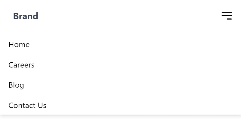
Nuxt 3 with Tailwind CSS Responsive Navbar with Search Bar
Vue
<script setup>
import { ref } from 'vue';

const isOpen = ref(false);
</script>
<template>
  <nav class="bg-white shadow-md">
    <div class="max-w-6xl mx-auto px-4">
      <div class="flex justify-between items-center">
        <div class="flex space-x-4">
          <!-- logo -->
          <div>
            <a href="#" class="flex items-center py-5 px-2 text-gray-700 hover:text-gray-900">
              <!-- Logo and company name -->
              <span class="font-bold">Brand</span>
            </a>
          </div>
          <!-- primary nav -->
          <div class="hidden md:flex items-center space-x-1">
            <a href="#" class="py-5 px-3 text-gray-700 hover:text-gray-900">Home</a>
            <a href="#" class="py-5 px-3 text-gray-700 hover:text-gray-900">Careers</a>
            <a href="#" class="py-5 px-3 text-gray-700 hover:text-gray-900">Blog</a>
            <a href="#" class="py-5 px-3 text-gray-700 hover:text-gray-900">Contact Us</a>
          </div>
        </div>
        <!-- search bar -->
        <div class="flex items-center">
          <input type="search" class="hidden md:block w-full md:max-w-xs rounded-md border-2 focus:outline-none border-gray-300 px-4 py-2 mr-4" placeholder="Search" />
        </div>
        <!-- mobile button -->
        <div class="md:hidden flex items-center">
          <button @click="isOpen = !isOpen" class="md:hidden">
            <svg xmlns="http://www.w3.org/2000/svg" class="h-6 w-6" fill="none" viewBox="0 0 24 24" stroke="currentColor" stroke-width="2">
              <path stroke-linecap="round" stroke-linejoin="round" d="M4 6h16M4 12h16m-7 6h7" />
            </svg>
          </button>
        </div>
      </div>
    </div>
    <!-- mobile menu -->
    <div class="md:hidden" :class="isOpen ? 'block' : 'hidden'">
      <a href="#" class="block py-2 px-4 text-sm hover:bg-gray-200">Home</a>
      <a href="#" class="block py-2 px-4 text-sm hover:bg-gray-200">Careers</a>
      <a href="#" class="block py-2 px-4 text-sm hover:bg-gray-200">Blog</a>
      <a href="#" class="block py-2 px-4 text-sm hover:bg-gray-200">Contact Us</a>
      <!-- mobile search bar -->
      <input type="search" class="w-full rounded-md border-gray-300 px-4 py-2 my-2" placeholder="Search" />
    </div>
  </nav>
</template>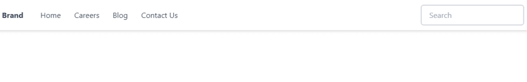
Build a Responsive Navbar with Search Bar Icon in Nuxt 3 Using TypeScript and Tailwind CSS
Vue
<script setup lang="ts">
import { ref } from 'vue';

const isOpen = ref<boolean>(false);
</script>
<template>
  <nav class="bg-white shadow">
    <div class="container mx-auto px-6 py-3 flex justify-between items-center">
      <a href="#" class="text-xl font-semibold text-gray-700">Brand</a>
      <div class="flex-1 ml-10">
        <div class="relative max-w-sm">
          <input type="text"
            class="w-full bg-gray-100 rounded border border-gray-300 focus:border-blue-500 focus:bg-white focus:ring-0 text-base outline-none text-gray-700 py-1 px-3 leading-8 transition-colors duration-200 ease-in-out"
            placeholder="Search">
          <div class="absolute inset-y-0 right-0 pr-3 flex items-center pointer-events-none">
            <!-- Search icon -->
            <svg xmlns="http://www.w3.org/2000/svg" fill="none" viewBox="0 0 24 24" stroke-width="1.5"
              stroke="currentColor" class="w-5 h-5">
              <path stroke-linecap="round" stroke-linejoin="round"
                d="M21 21l-5.197-5.197m0 0A7.5 7.5 0 105.196 5.196a7.5 7.5 0 0010.607 10.607z" />
            </svg>

          </div>
        </div>
      </div>
      <div class="flex items-center space-x-1">
        <a href="#" class="py-2 px-3 text-gray-700 hover:text-gray-900 hidden md:block">Home</a>
        <a href="#" class="py-2 px-3 text-gray-700 hover:text-gray-900 hidden md:block">Careers</a>
        <a href="#" class="py-2 px-3 text-gray-700 hover:text-gray-900 hidden md:block">Blog</a>
        <a href="#" class="py-2 px-3 text-gray-700 hover:text-gray-900 hidden md:block">Contact Us</a>
        <a href="#"
          class="py-2 px-3 bg-blue-500 text-white rounded hover:bg-blue-600 transition duration-300 hidden md:block">Get
          Started</a>
        <button @click="isOpen = !isOpen" class="text-gray-700 hover:text-gray-900 md:hidden">
          <svg class="w-6 h-6" fill="none" stroke="currentColor" viewBox="0 0 24 24" xmlns="http://www.w3.org/2000/svg">
            <path stroke-linecap="round" stroke-linejoin="round" stroke-width="2" d="M4 6h16M4 12h16M4 18h16"></path>
          </svg>
        </button>
      </div>
    </div>
    <!-- mobile menu -->
    <div :class="isOpen ? 'block' : 'hidden'" class="md:hidden">
      <a href="#" class="block py-2 px-4 text-sm hover:bg-gray-100">Home</a>
      <a href="#" class="block py-2 px-4 text-sm hover:bg-gray-100">Careers</a>
      <a href="#" class="block py-2 px-4 text-sm hover:bg-gray-100">Blog</a>
      <a href="#" class="block py-2 px-4 text-sm hover:bg-gray-100">Contact Us</a>
      <a href="#" class="block py-2 px-4 text-sm bg-blue-500 text-white rounded hover:bg-blue-600">Get Started</a>
    </div>
  </nav>
</template>
Javed sheikh
Hello there! I’m Javed Sheikh, a frontend developer with a passion for crafting seamless user experiences. With expertise in JavaScript frameworks like Vue.js, Svelte, and React, I bring creativity and innovation to every project I undertake. From building dynamic web applications to optimizing user interfaces,

