
To align an image to the right in a webpage using Bootstrap 5, you can simply apply the float-end class to the image element. Bootstrap 5 offers utility classes for managing CSS float properties, simplifying the alignment of elements.
Starting Bootstrap 5 Structure with CDN
<!DOCTYPE html>
<html lang="en">
  <head>
    <meta charset="utf-8" />
    <meta name="viewport" content="width=device-width, initial-scale=1" />
    <title>Bootstrap 5 float image right</title>
    <link
      href="https://cdn.jsdelivr.net/npm/bootstrap@5.3.2/dist/css/bootstrap.min.css"
      rel="stylesheet"
      integrity="sha384-T3c6CoIi6uLrA9TneNEoa7RxnatzjcDSCmG1MXxSR1GAsXEV/Dwwykc2MPK8M2HN"
      crossorigin="anonymous"
    />
  </head>
  <body>
    <!-- content -->
    <script
      src="https://cdn.jsdelivr.net/npm/bootstrap@5.3.2/dist/js/bootstrap.bundle.min.js"
      integrity="sha384-C6RzsynM9kWDrMNeT87bh95OGNyZPhcTNXj1NW7RuBCsyN/o0jlpcV8Qyq46cDfL"
      crossorigin="anonymous"
    ></script>
  </body>
</html>
1. Add the image using the <img> tag.
2. Apply the float-end class to the image for right alignment.
3. The text paragraphs enclosed in <p> tags will naturally wrap around the floated image.
<div class="container">
  <div class="row">
    <div class="col">
      <h1>How to use bootstrap 5 float image right</h1>

      <!-- Image floated to the right -->
      <img
        src="http://via.placeholder.com/640x360.jpg"
        class="float-end"
        alt="Descriptive Alt Text"
      />

      <!-- More text content, if needed -->
      <p>
        t is a long established ....
      </p>
    </div>
  </div>
</div>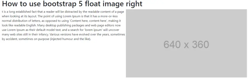
Bootstrap 5 Floating Image in a Card Component
<div class="container">
  <div class="card">
    <div class="card-body">
      <!-- Image floated to the right inside the card -->
      <img
        src="http://via.placeholder.com/160x160.jpg"
        class="float-end ms-3"
        alt="Descriptive Alt Text"
        style="width: 150px"
      />

      <h5 class="card-title">Card Title</h5>
      <p class="card-text">
        Some quick example text to build on the card title and make up the bulk
        of the card's content.
      </p>
    </div>
  </div>
</div>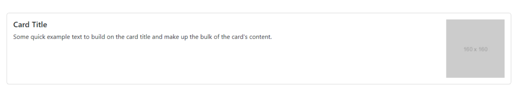
Bootstrap 5 Floating Image with Text Align
Float an image to the right and align text beside it using the Bootstrap 5 grid system for improved responsiveness.
<div class="container">
  <div class="row">
      <!-- Text Column -->
      <div class="col-md-8">
          <p>Lorem ipsum dolor sit amet, consectetur adipiscing elit...</p>
      </div>

      <!-- Image Column -->
      <div class="col-md-4">
          <img src="http://via.placeholder.com/640x360.jpg" class="img-fluid" alt="Descriptive Alt Text">
      </div>
  </div>
</div>
Javed sheikh

Hello there! I’m Javed Sheikh, a frontend developer with a passion for crafting seamless user experiences. With expertise in JavaScript frameworks like Vue.js, Svelte, and React, I bring creativity and innovation to every project I undertake. From building dynamic web applications to optimizing user interfaces,

