
In this tutorial, we will create dropdown in nuxtJS with Nuxtlabs UI. Before we begin, you need to install and configure Nuxtlabs UI in NuxtJS.
How to Install Nuxtlabs UI in Nuxt 3
1. Nuxt 3 with Nuxtlabs UI basic dropdown using UDropdown, UButton component.
Vue
<script setup>
const items = [
  [{
    label: 'Profile',
    avatar: {
      src: 'https://avatars.githubusercontent.com/u/739984?v=4'
    }
  }], [{
    label: 'Edit',
    icon: 'i-heroicons-pencil-square-20-solid',
    shortcuts: ['E'],
    click: () => {
      console.log('Edit')
    }
  }, {
    label: 'Duplicate',
    icon: 'i-heroicons-document-duplicate-20-solid',
    shortcuts: ['D'],
    disabled: true
  }], [{
    label: 'Archive',
    icon: 'i-heroicons-archive-box-20-solid'
  }, {
    label: 'Move',
    icon: 'i-heroicons-arrow-right-circle-20-solid'
  }], [{
    label: 'Delete',
    icon: 'i-heroicons-trash-20-solid',
    shortcuts: ['⌘', 'D']
  }]
]
</script>

<template>
  <UDropdown :items="items" :popper="{ placement: 'bottom-start' }">
    <UButton color="white" label="Options" trailing-icon="i-heroicons-chevron-down-20-solid" />
  </UDropdown>
</template>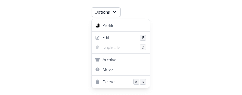
2. Nuxt 3 with Nuxtlabs UI dropdown on hover.
Vue
<script setup>
const items = [
  [{
    label: 'Profile',
    avatar: {
      src: 'https://avatars.githubusercontent.com/u/739984?v=4'
    }
  }]
]
</script>

<template>
  <UDropdown :items="items" mode="hover" :popper="{ placement: 'bottom-start' }">
    <UButton color="white" label="Options" trailing-icon="i-heroicons-chevron-down-20-solid" />
  </UDropdown>
</template>
3. Nuxt 3 with Nuxtlabs UI dropdown with icon, avatar.
Vue
<script setup>
const items = [
  [{
    label: 'ben@example.com',
    slot: 'account',
    disabled: true
  }], [{
    label: 'Settings',
    icon: 'i-heroicons-cog-8-tooth'
  }], [{
    label: 'Documentation',
    icon: 'i-heroicons-book-open'
  }, {
    label: 'Changelog',
    icon: 'i-heroicons-megaphone'
  }, {
    label: 'Status',
    icon: 'i-heroicons-signal'
  }], [{
    label: 'Sign out',
    icon: 'i-heroicons-arrow-left-on-rectangle'
  }]
]
</script>

<template>
  <UDropdown :items="items" :ui="{ item: { disabled: 'cursor-text select-text' } }" :popper="{ placement: 'bottom-start' }">
    <UAvatar src="https://avatars.githubusercontent.com/u/739984?v=4" />

    <template #account="{ item }">
      <div class="text-left">
        <p>
          Signed in as
        </p>
        <p class="truncate font-medium text-gray-900 dark:text-white">
          {{ item.label }}
        </p>
      </div>
    </template>

    <template #item="{ item }">
      <span class="truncate">{{ item.label }}</span>

      <UIcon :name="item.icon" class="flex-shrink-0 h-4 w-4 text-gray-400 dark:text-gray-500 ms-auto" />
    </template>
  </UDropdown>
</template>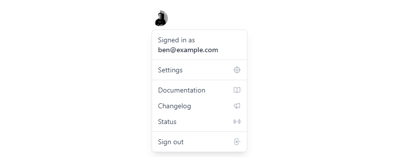
Javed sheikh

Hello there! I’m Javed Sheikh, a frontend developer with a passion for crafting seamless user experiences. With expertise in JavaScript frameworks like Vue.js, Svelte, and React, I bring creativity and innovation to every project I undertake. From building dynamic web applications to optimizing user interfaces,

