
In this tutorial, we will explore how to utilize Element Plus with Vue.js 3 alert components. We’ll cover various alert message types such as error, success, info, warning, etc. Additionally, we’ll demonstrate Element Plus UI framework alert components integrated with icons.
Install Element Plus in Vue 3 with TypeScript
Vue 3 Element Plus Alert Message Example
1. Element Plus Create a simple alert message using the el-alert component.
<template>
    <el-alert title="success alert" type="success" />
    <el-alert title="info alert" type="info" />
    <el-alert title="warning alert" type="warning" />
    <el-alert title="error alert" type="error" />
</template>

<style scoped>
.el-alert {
    margin: 20px 0 0;
}

.el-alert:first-child {
    margin: 0;
}
</style>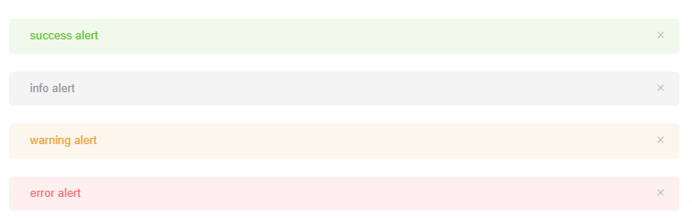
2. Element Plus alert message with theme effect.
<template>
  <el-alert title="success alert" type="success" effect="dark" />
  <el-alert title="info alert" type="info" effect="dark" />
  <el-alert title="warning alert" type="warning" effect="dark" />
  <el-alert title="error alert" type="error" effect="dark" />
</template>
<style scoped>
.el-alert {
  margin: 20px 0 0;
}

.el-alert:first-child {
  margin: 0;
}
</style>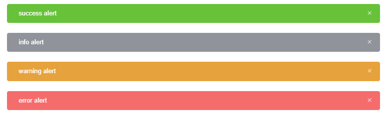
3. Vue 3 Element Plus Alert message with icons.
<template>
  <el-alert title="success alert" type="success" show-icon />
  <el-alert title="info alert" type="info" show-icon />
  <el-alert title="warning alert" type="warning" show-icon />
  <el-alert title="error alert" type="error" show-icon />
</template>
<style scoped>
.el-alert {
  margin: 20px 0 0;
}
.el-alert:first-child {
  margin: 0;
}
</style>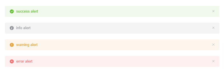
4. Vue 3 Element Plus alert message with description and icons.
<template>
  <el-alert
    title="success alert"
    type="success"
    description="more text description"
    show-icon
  />
  <el-alert
    title="info alert"
    type="info"
    description="more text description"
    show-icon
  />
  <el-alert
    title="warning alert"
    type="warning"
    description="more text description"
    show-icon
  />
  <el-alert
    title="error alert"
    type="error"
    description="more text description"
    show-icon
  />
</template>
<style scoped>
.el-alert {
  margin: 20px 0 0;
}
.el-alert:first-child {
  margin: 0;
}
</style>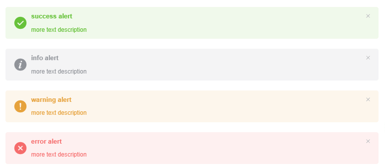
5. Vue 3 Element Plus alert message with customizable close button.
<template>
  <el-alert title="unclosable alert" type="success" :closable="false" />
  <el-alert title="customized close-text" type="info" close-text="Gotcha" />
  <el-alert title="alert with callback" type="warning" @close="hello" />
</template>

<script lang="ts" setup>
const hello = () => {
  // eslint-disable-next-line no-alert
  alert('Hello World!')
}
</script>
<style scoped>
.el-alert {
  margin: 20px 0 0;
}
.el-alert:first-child {
  margin: 0;
}
</style>
Javed sheikh

Hello there! I’m Javed Sheikh, a frontend developer with a passion for crafting seamless user experiences. With expertise in JavaScript frameworks like Vue.js, Svelte, and React, I bring creativity and innovation to every project I undertake. From building dynamic web applications to optimizing user interfaces,

