
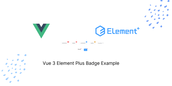
In this tutorial, we will see Element Plus with Vue.js 3 Badge components. We will see plan rounded and circle badge, Badge with icons.
Install Element Plus in Vue 3 with TypeScript
Vue 3 Element Plus Badge Example
1. Vue 3 Element Plus Badge value with String, Number.
Vue
<template>
    <el-row justify="center">
        <el-col :span="8">
            <el-badge :value="12" class="item">
                <el-button>comments</el-button>
            </el-badge>
            <el-badge :value="3" class="item">
                <el-button>replies</el-button>
            </el-badge>
            <el-badge :value="1" class="item" type="primary">
                <el-button>comments</el-button>
            </el-badge>
            <el-badge :value="2" class="item" type="warning">
                <el-button>replies</el-button>
            </el-badge>

            <el-dropdown trigger="click">
                <span class="el-dropdown-link">
                    Click Me
                    <el-icon class="el-icon--right"><caret-bottom /></el-icon>
                </span>
                <template #dropdown>
                    <el-dropdown-menu>
                        <el-dropdown-item class="clearfix">
                            comments
                            <el-badge class="mark" :value="12" />
                        </el-dropdown-item>
                        <el-dropdown-item class="clearfix">
                            replies
                            <el-badge class="mark" :value="3" />
                        </el-dropdown-item>
                    </el-dropdown-menu>
                </template>
            </el-dropdown>
        </el-col>
    </el-row>
</template>


<script lang="ts" setup>
import { CaretBottom } from '@element-plus/icons-vue'
</script>

<style scoped>
.item {
  margin-top: 10px;
  margin-right: 40px;
}
.el-dropdown {
  margin-top: 1.1rem;
}
</style>
2. Vue 3 Element Plus Badge with Max Value.
Vue
<template>
    <el-row justify="center">
        <el-col :span="8">
            <el-badge :value="200" :max="99" class="item">
                <el-button>comments</el-button>
            </el-badge>
            <el-badge :value="100" :max="10" class="item">
                <el-button>replies</el-button>
            </el-badge>
        </el-col>
    </el-row>
</template>


<style scoped>
.item {
  margin-top: 10px;
  margin-right: 40px;
}
</style>
3. Vue 3 Element Plus Customize Badge.
Vue
<template>
    <el-badge value="new" class="item">
        <el-button>comments</el-button>
    </el-badge>
    <el-badge value="hot" class="item">
        <el-button>replies</el-button>
    </el-badge>
</template>

<style scoped>
.item {
    margin-top: 10px;
    margin-right: 40px;
}
</style>
4. Vue 3 Element Plus Dot Badge with Icon.
Vue
<template>
    <el-row justify="center">
        <el-badge is-dot class="item">Online</el-badge>
        <el-badge is-dot class="item">
            <el-button class="share-button" :icon="Share" type="primary" />
        </el-badge>
    </el-row>
</template>

<script lang="ts" setup>
import { Share } from '@element-plus/icons-vue'
</script>

<style scoped>
.item {
    margin-top: 10px;
    margin-right: 40px;
}
</style>
Javed sheikh
Hello there! I’m Javed Sheikh, a frontend developer with a passion for crafting seamless user experiences. With expertise in JavaScript frameworks like Vue.js, Svelte, and React, I bring creativity and innovation to every project I undertake. From building dynamic web applications to optimizing user interfaces,

