In this tutorial, we will explore how to use Vuetify.js 3 in Vue.js 3 to create button components. We’ll cover outline buttons, flat buttons, and buttons with icons. Before we begin, make sure you’ve installed and configured Vuetify 3 in Vue 3.
How to Install Vuetify 3 in Vue 3
Vuetify 3 Buttons Tutorial Examples
1. Vuetify 3 Create simple buttons using the v-btn component.
<v-btn> Button </v-btn>
<v-btn color="primary"> Button </v-btn>
<v-btn color="secondary"> Button </v-btn>
<v-btn color="error"> Button </v-btn>
<v-btn color="warning"> Button </v-btn>
<v-btn color="success"> Button </v-btn>
<v-btn color="black"> Button </v-btn>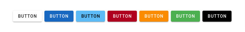
2. Vue 3 Vuetify 3: Create outline buttons using the v-btn component and variant="outlined".
<template>
  <v-btn variant="outlined"> Button </v-btn>
  <v-btn color="primary" variant="outlined"> Button </v-btn>
  <v-btn color="secondary" variant="outlined"> Button </v-btn>
  <v-btn color="error" variant="outlined"> Button </v-btn>
  <v-btn color="warning" variant="outlined"> Button </v-btn>
  <v-btn color="success" variant="outlined"> Button </v-btn>
  <v-btn color="black" variant="outlined"> Button </v-btn>
</template>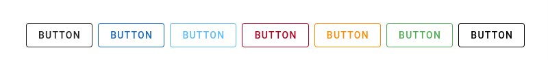
3. Vue 3 Vuetify 3 Create tonal buttons, text buttons, and plain buttons using the v-btn component with variant="tonal", variant="text", and variant="plain".
<template>
  <v-btn variant="tonal"> Button </v-btn>
  <v-btn color="primary" variant="tonal"> Button </v-btn>
  <v-btn variant="text"> Button </v-btn>
  <v-btn color="primary" variant="text"> Button </v-btn>
  <v-btn variant="plain"> Button </v-btn>
  <v-btn color="primary" variant="plain"> Button </v-btn>
</template>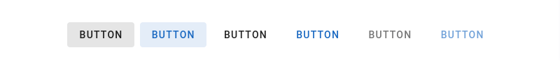
4. Vue 3 Vuetify 3: Create buttons with icons positioned before, after, and on top of the button text using the v-btn component with stacked prepend-icon="mdi-vuetify" and append-icon="mdi-vuetify".
<template>
  <v-btn prepend-icon="mdi-vuetify"> Button </v-btn>
  <v-btn append-icon="mdi-vuetify"> Button </v-btn>
  <v-btn stacked prepend-icon="mdi-vuetify"> Button </v-btn>
</template>
5. Vue 3 Vuetify 3 Create block buttons using the v-btn component and v-block.
<template>
  <div class="fill-height">
    <v-btn block>
      Block Button
    </v-btn>
  </div>
</template>
6. Vue 3 Vuetify 3: Create flat buttons. Vuetify flat buttons have background color but no box shadow, using the v-btn component with variant="flat".
<template>
  <v-btn variant="flat"> Button </v-btn>
  <v-btn variant="flat" color="primary"> Button </v-btn>
  <v-btn variant="flat" color="secondary"> Button </v-btn>
  <v-btn variant="flat" color="error"> Button </v-btn>
  <v-btn variant="flat" color="warning"> Button </v-btn>
  <v-btn variant="flat" color="success"> Button </v-btn>
  <v-btn variant="flat" color="black"> Button </v-btn>
</template>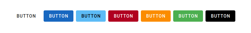
7. Vue 3 Vuetify 3 Create icon buttons using the v-btn component and v-icon.
<template>
  <v-container>
    <v-row justify="space-between" class="text-center">
      <v-col>
        <v-btn icon="mdi-heart" color="primary"></v-btn>
      </v-col>

      <v-col>
        <v-btn icon="mdi-star" color="secondary"></v-btn>
      </v-col>

      <v-col>
        <v-btn icon="mdi-cached" color="info"></v-btn>
      </v-col>

      <v-col>
        <v-btn icon="mdi-thumb-up" color="success"></v-btn>
      </v-col>
    </v-row>

    <v-row justify="space-between" class="text-center">
      <v-col>
        <v-btn icon color="primary">
          <v-icon>mdi-heart</v-icon>
        </v-btn>
      </v-col>

      <v-col>
        <v-btn icon color="secondary">
          <v-icon>mdi-star</v-icon>
        </v-btn>
      </v-col>

      <v-col>
        <v-btn icon color="info">
          <v-icon>mdi-cached</v-icon>
        </v-btn>
      </v-col>

      <v-col>
        <v-btn icon color="success">
          <v-icon>mdi-thumb-up</v-icon>
        </v-btn>
      </v-col>
    </v-row>
  </v-container>
</template>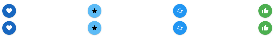
Javed sheikh
Hello there! I’m Javed Sheikh, a frontend developer with a passion for crafting seamless user experiences. With expertise in JavaScript frameworks like Vue.js, Svelte, and React, I bring creativity and innovation to every project I undertake. From building dynamic web applications to optimizing user interfaces,

