

In this tutorial, we will explore how to use lists components using Vuetify.js 3 in Vue.js 3. We’ll cover lists grouping and the types prop. Before we begin, make sure you’ve installed and configured Vuetify 3 in Vue 3.
How to Install Vuetify 3 in Vue 3
Vuetify 3 Vue 3 Lists Example
1. Vuetify 3 Vue 3 Basic single-line (default), two-line, and three-line lists using the v-list and v-list-item components.
<template>
  <div>
    <v-list lines="one">
      <v-list-item v-for="item in items" :key="item.title" :title="item.title" subtitle="line one"></v-list-item>
    </v-list>
    <v-list lines="two">
      <v-list-item v-for="item in items" :key="item.title" :title="item.title" subtitle="line two"></v-list-item>
    </v-list>
    <v-list lines="three">
      <v-list-item v-for="item in items" :key="item.title" :title="item.title" subtitle="line three"></v-list-item>
    </v-list>
  </div>
</template>

<script>
export default {
  data: () => ({
    items: [
      {
        title: 'Item #1',
        value: 1,
      },
      {
        title: 'Item #2',
        value: 2,
      },
      {
        title: 'Item #3',
        value: 3,
      },
    ],
  }),
}
</script>
2. Vuetify 3 Vue 3 lists component with card.
<template>
  <v-card class="mx-auto" max-width="300">
    <v-list :items="items"></v-list>
  </v-card>
</template>
<script>
export default {
  data: () => ({
    items: [
      {
        title: 'Item #1',
        value: 1,
      },
      {
        title: 'Item #2',
        value: 2,
      },
      {
        title: 'Item #3',
        value: 3,
      },
    ],
  }),
}
</script>
3. Vuetify 3 Vue 3 lists with item-title and item-value props.
<template>
  <v-card class="mx-auto" max-width="300">
    <v-list :items="items" item-title="name" item-value="id"></v-list>
  </v-card>
</template>
<script>
export default {
  data: () => ({
    items: [
      {
        name: 'Item #1',
        id: 1,
      },
      {
        name: 'Item #2',
        id: 2,
      },
      {
        name: 'Item #3',
        id: 3,
      },
    ],
  }),
}
</script>
4. Vuetify 3 Vue 3 lists items with list group.
<template>
  <v-card class="mx-auto mt-4" max-width="300">
    <v-list :items="items"></v-list>
  </v-card>
</template>
<script>
export default {
  data: () => ({
    items: [
      { type: 'subheader', title: 'Group #1' },
      {
        title: 'Item #1',
        value: 1,
      },
      {
        title: 'Item #2',
        value: 2,
      },
      {
        title: 'Item #3',
        value: 3,
      },
      { type: 'divider' },
      { type: 'subheader', title: 'Group #2' },
      {
        title: 'Item #4',
        value: 4,
      },
      {
        title: 'Item #5',
        value: 5,
      },
      {
        title: 'Item #6',
        value: 6,
      },
    ],
  }),
}
</script>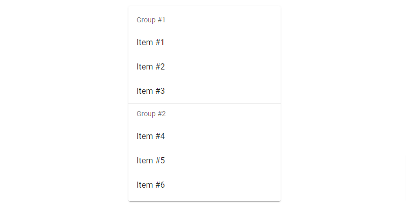
5. Vuetify 3 vue 3 lists items with props.
<template>
  <v-card class="mx-auto" max-width="300">
    <v-list :items="items"></v-list>
  </v-card>
</template>
<script>
export default {
  data: () => ({
    items: [
      {
        title: 'Item #1',
        value: 1,
        props: {
          prependIcon: 'mdi-home',
        },
      },
      {
        title: 'Item #2',
        value: 2,
        props: {
          appendIcon: 'mdi-close',
        },
      },
      {
        title: 'Item #3',
        value: 3,
        props: {
          color: 'primary',
        },
      },
    ],
  }),
}
</script>
6. Vuetify 3 vue 3 lists items with icons.
<template>
  <v-card class="mx-auto" max-width="300">
    <v-list density="compact">
      <v-list-subheader>REPORTS</v-list-subheader>

      <v-list-item v-for="(item, i) in items" :key="i" :value="item" active-color="primary">
        <template v-slot:prepend>
          <v-icon :icon="item.icon"></v-icon>
        </template>

        <v-list-item-title v-text="item.text"></v-list-item-title>
      </v-list-item>
    </v-list>
  </v-card>
</template>
<script>
export default {
  data: () => ({
    items: [
      { text: 'Real-Time', icon: 'mdi-clock' },
      { text: 'Audience', icon: 'mdi-account' },
      { text: 'Conversions', icon: 'mdi-flag' },
    ],
  }),
}
</script>
7. Vuetify 3 vue 3 lists items with plain variant, tonal variant.
<template>
  <v-card class="mx-auto" max-width="300">
    <v-list>
      <v-list-subheader>Plain Variant</v-list-subheader>

      <v-list-item v-for="(item, i) in items" :key="i" :value="item" active-color="primary" variant="plain">
        <template v-slot:prepend>
          <v-icon :icon="item.icon"></v-icon>
        </template>

        <v-list-item-title v-text="item.text"></v-list-item-title>
      </v-list-item>
    </v-list>

    <v-list>
      <v-list-subheader>Tonal Variant</v-list-subheader>

      <v-list-item v-for="(item, i) in items" :key="i" :value="item" active-color="primary" variant="tonal">
        <template v-slot:prepend>
          <v-icon :icon="item.icon"></v-icon>
        </template>

        <v-list-item-title v-text="item.text"></v-list-item-title>
      </v-list-item>
    </v-list>
  </v-card>
</template>
<script>
export default {
  data: () => ({
    items: [
      { text: 'Real-Time', icon: 'mdi-clock' },
      { text: 'Audience', icon: 'mdi-account' },
      { text: 'Conversions', icon: 'mdi-flag' },
    ],
  }),
}
</script>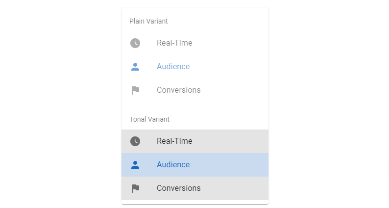
8. Vuetify 3 Vue 3 lists items with navigation (nav).
<template>
  <v-card class="mx-auto" width="256">
    <v-layout>
      <v-navigation-drawer permanent absolute>
        <v-list>
          <v-list-item prepend-avatar="https://cdn.vuetifyjs.com/images/john.png" title="John Leider"
            subtitle="john@google.com">
            <template v-slot:append>
              <v-btn size="small" variant="text" icon="mdi-menu-down"></v-btn>
            </template>
          </v-list-item>
        </v-list>

        <v-divider></v-divider>

        <v-list :lines="false" density="compact" nav>
          <v-list-item v-for="(item, i) in items" :key="i" :value="item" active-color="primary">
            <template v-slot:prepend>
              <v-icon :icon="item.icon"></v-icon>
            </template>

            <v-list-item-title v-text="item.text"></v-list-item-title>
          </v-list-item>
        </v-list>
      </v-navigation-drawer>

      <v-main style="height: 354px;"></v-main>
    </v-layout>
  </v-card>
</template>
<script>
export default {
  data: () => ({
    selectedItem: 0,
    items: [
      { text: 'My Files', icon: 'mdi-folder' },
      { text: 'Shared with me', icon: 'mdi-account-multiple' },
      { text: 'Starred', icon: 'mdi-star' },
      { text: 'Recent', icon: 'mdi-history' },
      { text: 'Offline', icon: 'mdi-check-circle' },
      { text: 'Uploads', icon: 'mdi-upload' },
      { text: 'Backups', icon: 'mdi-cloud-upload' },
    ],
  }),
}
</script>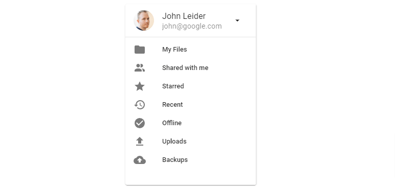
9. Vuetify 3 Vue 3 lists group with subgroups.
<template>
  <v-card class="mx-auto" width="300">
    <v-list v-model:opened="open">
      <v-list-item prepend-icon="mdi-home" title="Home"></v-list-item>

      <v-list-group value="Users">
        <template v-slot:activator="{ props }">
          <v-list-item v-bind="props" prepend-icon="mdi-account-circle" title="Users"></v-list-item>
        </template>

        <v-list-group value="Admin">
          <template v-slot:activator="{ props }">
            <v-list-item v-bind="props" title="Admin"></v-list-item>
          </template>

          <v-list-item v-for="([title, icon], i) in admins" :key="i" :title="title" :prepend-icon="icon"
            :value="title"></v-list-item>
        </v-list-group>

        <v-list-group value="Actions">
          <template v-slot:activator="{ props }">
            <v-list-item v-bind="props" title="Actions"></v-list-item>
          </template>

          <v-list-item v-for="([title, icon], i) in cruds" :key="i" :value="title" :title="title"
            :prepend-icon="icon"></v-list-item>
        </v-list-group>
      </v-list-group>
    </v-list>
  </v-card>
</template>
<script>
export default {
  data: () => ({
    open: ['Users'],
    admins: [
      ['Management', 'mdi-account-multiple-outline'],
      ['Settings', 'mdi-cog-outline'],
    ],
    cruds: [
      ['Create', 'mdi-plus-outline'],
      ['Read', 'mdi-file-outline'],
      ['Update', 'mdi-update'],
      ['Delete', 'mdi-delete'],
    ],
  }),
}
</script>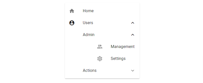
Javed sheikh

Hello there! I’m Javed Sheikh, a frontend developer with a passion for crafting seamless user experiences. With expertise in JavaScript frameworks like Vue.js, Svelte, and React, I bring creativity and innovation to every project I undertake. From building dynamic web applications to optimizing user interfaces,

