
In this tutorial, we will explore modal dialogs using Vuetify.js 3 in Vue.js 3. We will cover popup dialogs, full-screen modals, and scrollable modals. Before we begin, you need to install and configure Vuetify 3 in Vue 3.
How to Install Vuetify 3 in Vue 3
Vuetify 3 Vue 3 Modal Dialog Example
1. Vuetify 3 vue 3 basic dialog using v-dialog component.
<template>
  <div class="text-center">
    <v-dialog v-model="dialog" width="auto">
      <template v-slot:activator="{ props }">
        <v-btn color="primary" v-bind="props">
          Open Dialog
        </v-btn>
      </template>

      <v-card>
        <v-card-text>
          Vuetify 3 Vue 3 Modal Dialog Open After Click e et dolore magna aliqua.
        </v-card-text>
        <v-card-actions>
          <v-btn color="primary" block @click="dialog = false">Close Dialog</v-btn>
        </v-card-actions>
      </v-card>
    </v-dialog>
  </div>
</template>
<script>
export default {
  data() {
    return {
      dialog: false,
    }
  },
}
</script>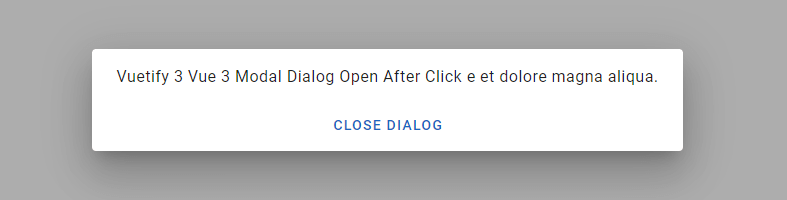
2. Vuetify 3 vue 3 modal dialog using v-dialog component and v-model.
<template>
  <div class="text-center">
    <v-btn
      color="primary"
      @click="dialog = true"
    >
      Open Dialog
    </v-btn>

    <v-dialog
      v-model="dialog"
      width="auto"
    >
      <v-card>
        <v-card-text>
          Vuetify 3 vue 3 modal dialog using v-dialog component and v-model.
        </v-card-text>
        <v-card-actions>
          <v-btn color="primary" block @click="dialog = false">Close Dialog</v-btn>
        </v-card-actions>
      </v-card>
    </v-dialog>
  </div>
</template>
<script>
  export default {
    data () {
      return {
        dialog: false,
      }
    },
  }
</script>
3. Vuetify 3 Vue 3 fullscreen modal dialog.
<template>
    <v-row justify="center">
        <v-dialog v-model="dialog" fullscreen :scrim="false" transition="dialog-bottom-transition">
            <template v-slot:activator="{ props }">
                <v-btn color="primary" dark v-bind="props">
                    Open Dialog
                </v-btn>
            </template>
            <v-card>
                <v-toolbar dark color="primary">
                    <v-btn icon dark @click="dialog = false">
                        <v-icon>mdi-close</v-icon>
                    </v-btn>
                    <v-toolbar-title>Settings</v-toolbar-title>
                    <v-spacer></v-spacer>
                    <v-toolbar-items>
                        <v-btn variant="text" @click="dialog = false">
                            Save
                        </v-btn>
                    </v-toolbar-items>
                </v-toolbar>
                <v-list lines="two" subheader>
                    <v-list-subheader>User Controls</v-list-subheader>
                    <v-list-item title="Content filtering"
                        subtitle="Set the content filtering level to restrict apps that can be downloaded"></v-list-item>
                    <v-list-item title="Password"
                        subtitle="Require password for purchase or use password to restrict purchase"></v-list-item>
                </v-list>
                <v-divider></v-divider>
                <v-list lines="two" subheader>
                    <v-list-subheader>General</v-list-subheader>
                    <v-list-item title="Notifications"
                        subtitle="Notify me about updates to apps or games that I downloaded">
                        <template v-slot:prepend>
                            <v-checkbox v-model="notifications"></v-checkbox>
                        </template>
                    </v-list-item>
                    <v-list-item title="Sound" subtitle="Auto-update apps at any time. Data charges may apply">
                        <template v-slot:prepend>
                            <v-checkbox v-model="sound"></v-checkbox>
                        </template>
                    </v-list-item>
                    <v-list-item title="Auto-add widgets" subtitle="Automatically add home screen widgets">
                        <template v-slot:prepend>
                            <v-checkbox v-model="widgets"></v-checkbox>
                        </template>
                    </v-list-item>
                </v-list>
            </v-card>
        </v-dialog>
    </v-row>
</template>
<script>
export default {
    data() {
        return {
            dialog: false,
            notifications: false,
            sound: true,
            widgets: false,
        }
    },
}
</script>
4. Vuetify 3 Vue 3 transitions modal dialog from the bottom and from the top.
<template>
  <v-row justify="space-around">
    <v-col cols="auto">
      <v-dialog transition="dialog-bottom-transition" width="auto">
        <template v-slot:activator="{ props }">
          <v-btn color="primary" v-bind="props">From the bottom</v-btn>
        </template>
        <template v-slot:default="{ isActive }">
          <v-card>
            <v-toolbar color="primary" title="Opening from the bottom"></v-toolbar>
            <v-card-text>
              <div class="text-h2 pa-12">Hello world!</div>
            </v-card-text>
            <v-card-actions class="justify-end">
              <v-btn variant="text" @click="isActive.value = false">Close</v-btn>
            </v-card-actions>
          </v-card>
        </template>
      </v-dialog>
    </v-col>

    <v-col cols="auto">
      <v-dialog transition="dialog-top-transition" width="auto">
        <template v-slot:activator="{ props }">
          <v-btn color="primary" v-bind="props">From the top</v-btn>
        </template>
        <template v-slot:default="{ isActive }">
          <v-card>
            <v-toolbar color="primary" title="Opening from the top"></v-toolbar>
            <v-card-text>
              <div class="text-h2 pa-12">Hello world!</div>
            </v-card-text>
            <v-card-actions class="justify-end">
              <v-btn variant="text" @click="isActive.value = false">Close</v-btn>
            </v-card-actions>
          </v-card>
        </template>
      </v-dialog>
    </v-col>
  </v-row>
</template>
5. Vuetify 3 vue 3 Persistent dialogs are not dismissed when touching outside or pressing the esc key.
<template>
  <v-row justify="center">
    <v-dialog v-model="dialog" persistent width="auto">
      <template v-slot:activator="{ props }">
        <v-btn color="primary" v-bind="props">
          Open Dialog
        </v-btn>
      </template>
      <v-card>
        <v-card-title class="text-h5">
          Use Google's location service?
        </v-card-title>
        <v-card-text>Let Google help apps determine location. This means sending anonymous location data to Google, even
          when no apps are running.</v-card-text>
        <v-card-actions>
          <v-spacer></v-spacer>
          <v-btn color="green-darken-1" variant="text" @click="dialog = false">
            Disagree
          </v-btn>
          <v-btn color="green-darken-1" variant="text" @click="dialog = false">
            Agree
          </v-btn>
        </v-card-actions>
      </v-card>
    </v-dialog>
  </v-row>
</template>
<script>
export default {
  data() {
    return {
      dialog: false,
    }
  },
}
</script>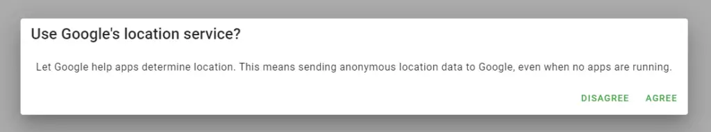
6. Vuetify 3 vue 3 popup dialog with scrollable content.
<template>
  <v-row justify="center">
    <v-dialog v-model="dialog" scrollable width="auto">
      <template v-slot:activator="{ props }">
        <v-btn color="primary" v-bind="props">
          Open Dialog
        </v-btn>
      </template>
      <v-card>
        <v-card-title>Select Country</v-card-title>
        <v-divider></v-divider>
        <v-card-text style="height: 300px;">
          <v-radio-group v-model="dialogm1" column>
            <v-radio label="Bahamas, The" value="bahamas"></v-radio>
            <v-radio label="Bahrain" value="bahrain"></v-radio>
            <v-radio label="Bangladesh" value="bangladesh"></v-radio>
            <v-radio label="Barbados" value="barbados"></v-radio>
            <v-radio label="Belarus" value="belarus"></v-radio>
            <v-radio label="Belgium" value="belgium"></v-radio>
            <v-radio label="Belize" value="belize"></v-radio>
            <v-radio label="Benin" value="benin"></v-radio>
            <v-radio label="Bhutan" value="bhutan"></v-radio>
            <v-radio label="Bolivia" value="bolivia"></v-radio>
            <v-radio label="Bosnia and Herzegovina" value="bosnia"></v-radio>
            <v-radio label="Botswana" value="botswana"></v-radio>
            <v-radio label="Brazil" value="brazil"></v-radio>
            <v-radio label="Brunei" value="brunei"></v-radio>
            <v-radio label="Bulgaria" value="bulgaria"></v-radio>
            <v-radio label="Burkina Faso" value="burkina"></v-radio>
            <v-radio label="Burma" value="burma"></v-radio>
            <v-radio label="Burundi" value="burundi"></v-radio>
          </v-radio-group>
        </v-card-text>
        <v-divider></v-divider>
        <v-card-actions>
          <v-btn color="blue-darken-1" variant="text" @click="dialog = false">
            Close
          </v-btn>
          <v-btn color="blue-darken-1" variant="text" @click="dialog = false">
            Save
          </v-btn>
        </v-card-actions>
      </v-card>
    </v-dialog>
  </v-row>
</template>
<script>
export default {
  data() {
    return {
      dialogm1: '',
      dialog: false,
    }
  },
}
</script>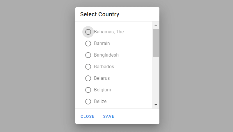
7. Vuetify 3 vue 3 dialog with form.
<template>
  <v-row justify="center">
    <v-dialog v-model="dialog" persistent width="1024">
      <template v-slot:activator="{ props }">
        <v-btn color="primary" v-bind="props">
          Open Dialog
        </v-btn>
      </template>
      <v-card>
        <v-card-title>
          <span class="text-h5">User Profile</span>
        </v-card-title>
        <v-card-text>
          <v-container>
            <v-row>
              <v-col cols="12" sm="6" md="4">
                <v-text-field label="Legal first name*" required></v-text-field>
              </v-col>
              <v-col cols="12" sm="6" md="4">
                <v-text-field label="Legal middle name" hint="example of helper text only on focus"></v-text-field>
              </v-col>
              <v-col cols="12" sm="6" md="4">
                <v-text-field label="Legal last name*" hint="example of persistent helper text" persistent-hint
                  required></v-text-field>
              </v-col>
              <v-col cols="12">
                <v-text-field label="Email*" required></v-text-field>
              </v-col>
              <v-col cols="12">
                <v-text-field label="Password*" type="password" required></v-text-field>
              </v-col>
              <v-col cols="12" sm="6">
                <v-select :items="['0-17', '18-29', '30-54', '54+']" label="Age*" required></v-select>
              </v-col>
              <v-col cols="12" sm="6">
                <v-autocomplete
                  :items="['Skiing', 'Ice hockey', 'Soccer', 'Basketball', 'Hockey', 'Reading', 'Writing', 'Coding', 'Basejump']"
                  label="Interests" multiple></v-autocomplete>
              </v-col>
            </v-row>
          </v-container>
          <small>*indicates required field</small>
        </v-card-text>
        <v-card-actions>
          <v-spacer></v-spacer>
          <v-btn color="blue-darken-1" variant="text" @click="dialog = false">
            Close
          </v-btn>
          <v-btn color="blue-darken-1" variant="text" @click="dialog = false">
            Save
          </v-btn>
        </v-card-actions>
      </v-card>
    </v-dialog>
  </v-row>
</template>
<script>
export default {
  data: () => ({
    dialog: false,
  }),
}
</script>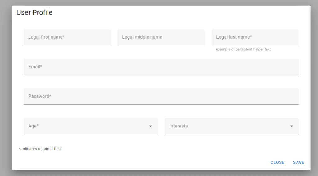
8. Vuetify 3 vue 3 loading popup dialog modal.
<template>
  <div class="text-center">
    <v-btn :disabled="dialog" :loading="dialog" color="purple-darken-2" @click="dialog = true">
      Start loading
    </v-btn>
    <v-dialog v-model="dialog" :scrim="false" persistent width="auto">
      <v-card color="primary">
        <v-card-text>
          Please stand by
          <v-progress-linear indeterminate color="white" class="mb-0"></v-progress-linear>
        </v-card-text>
      </v-card>
    </v-dialog>
  </div>
</template>
<script>
export default {
  data() {
    return {
      dialog: false,
    }
  },

  watch: {
    dialog(val) {
      if (!val) return

      setTimeout(() => (this.dialog = false), 4000)
    },
  },
}
</script>
Javed sheikh

Hello there! I’m Javed Sheikh, a frontend developer with a passion for crafting seamless user experiences. With expertise in JavaScript frameworks like Vue.js, Svelte, and React, I bring creativity and innovation to every project I undertake. From building dynamic web applications to optimizing user interfaces,

