
In this tutorial, we will explore tooltips using Vuetify.js 3 in Vue.js 3. We’ll cover tooltips on hover, tooltips positioned at the top, bottom, left, and right. Before we begin, you need to install and configure Vuetify 3 in Vue 3.
How to Install Vuetify 3 in Vue 3
Vuetify 3 Vue 3 Tooltips Example
1. Vuetify 3 Vue 3 basic tooltips using the v-tooltip component.
<v-tooltip text="Tooltip">
    <template v-slot:activator="{ props }">
      <v-btn v-bind="props">Hover Over me</v-btn>
    </template>
</v-tooltip>
2. Vuetify 3 Vue 3 Create tooltips positioned at the top, bottom, left, and right.
<template>
    <div class="d-flex justify-space-around">
        <v-btn>
            Start
            <v-tooltip activator="parent" location="start">Tooltip</v-tooltip>
        </v-btn>

        <v-btn>
            End
            <v-tooltip activator="parent" location="end">Tooltip</v-tooltip>
        </v-btn>

        <v-btn>
            Top
            <v-tooltip activator="parent" location="top">Tooltip</v-tooltip>
        </v-btn>

        <v-btn>
            Bottom
            <v-tooltip activator="parent" location="bottom">Tooltip</v-tooltip>
        </v-btn>
    </div>
</template>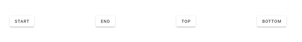
3. Vuetify 3 Vue 3 tooltips with toggle and icon.
<template>
    <v-container fluid class="text-center">
        <v-row class="flex" justify="space-between">
            <v-col cols="12">
                <v-btn @click="show = !show">
                    toggle
                </v-btn>
            </v-col>

            <v-col cols="12" class="mt-12">
                <v-tooltip v-model="show" location="top">
                    <template v-slot:activator="{ props }">
                        <v-btn icon v-bind="props">
                            <v-icon color="grey-lighten-1">
                                mdi-cart
                            </v-icon>
                        </v-btn>
                    </template>
                    <span>Programmatic tooltip</span>
                </v-tooltip>
            </v-col>
        </v-row>
    </v-container>
</template>
<script>
export default {
    data() {
        return {
            show: false,
        }
    },
}
</script>
Javed sheikh

Hello there! I’m Javed Sheikh, a frontend developer with a passion for crafting seamless user experiences. With expertise in JavaScript frameworks like Vue.js, Svelte, and React, I bring creativity and innovation to every project I undertake. From building dynamic web applications to optimizing user interfaces,

