In this tutorial, we will see vue 3 ant design buttons component.
Install Vite + Ant Design + TypeScript In Vue 3
1. Vue 3 ant design buttons component with primary, Default, Dashed, Text, Link.
Vue
<template>
  <a-button type="primary">Primary Button</a-button>
  <a-button>Default Button</a-button>
  <a-button type="dashed">Dashed Button</a-button>
  <a-button type="text">Text Button</a-button>
  <a-button type="link">Link Button</a-button>
</template>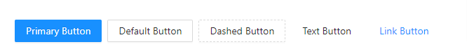
2. Vue 3 ant design ghost buttons component.
Vue
<template>
 <div :style="{ background: 'rgb(190, 200, 200)', padding: '26px 16px 16px' }">
  <a-button type="primary" ghost>Primary</a-button>
  <a-button ghost>Default</a-button>
  <a-button type="dashed" ghost>Dashed</a-button>
  <a-button type="primary" danger ghost>Danger</a-button>
 </div>
</template>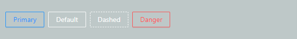
3. Vue 3 ant design disabled buttons component.
Vue
<template>
 <a-button type="primary">Primary</a-button>
 <a-button type="primary" disabled>Primary(disabled)</a-button>
 <br />
 <a-button>Default</a-button>
 <a-button disabled>Default(disabled)</a-button>
 <br />
 <a-button type="dashed">Dashed</a-button>
 <a-button type="dashed" disabled>Dashed(disabled)</a-button>
 <br />
 <a-button type="text">Text</a-button>
 <a-button type="text" disabled>Text(disabled)</a-button>
 <br />
 <a-button type="link">Link</a-button>
 <a-button type="link" disabled>Link(disabled)</a-button>
 <br />
 <a-button danger>Danger Default</a-button>
 <a-button danger disabled>Danger Default(disabled)</a-button>
 <br />
 <a-button type="text" danger>Danger Text</a-button>
 <a-button type="text" danger disabled>Danger Text(disabled)</a-button>
 <br />
 <a-button type="link" danger>Danger Link</a-button>
 <a-button type="link" danger disabled>Danger Link(disabled)</a-button>
 <br />

 <div :style="{ padding: '8px 8px 0 8px', background: 'rgb(190, 200, 200)' }">
  <a-button ghost>Ghost</a-button>
  <a-button ghost disabled>Ghost(disabled)</a-button>
 </div>
</template>
4. Vue 3 ant design buttons component with icons.
Vue
<template>
 <a-button type="primary" shape="circle">
  <template #icon><SearchOutlined /></template>
 </a-button>
 <a-button type="primary" shape="circle">A</a-button>
 <a-button type="primary">
  <template #icon><SearchOutlined /></template>
  Search
 </a-button>
 <a-button shape="circle">
  <template #icon><SearchOutlined /></template>
 </a-button>
 <a-button>
  <template #icon><SearchOutlined /></template>
  Search
 </a-button>
 <a-button shape="circle">
  <template #icon><SearchOutlined /></template>
 </a-button>
 <a-button>
  <template #icon><SearchOutlined /></template>
  Search
 </a-button>
 <a-button type="dashed" shape="circle">
  <template #icon><SearchOutlined /></template>
 </a-button>
 <a-button type="dashed">
  <template #icon><SearchOutlined /></template>
  Search
 </a-button>
 <a-button href="https://www.google.com">
  <template #icon><SearchOutlined /></template>
 </a-button>
 <br />
 <br />
 <a-tooltip title="search">
  <a-button type="primary" shape="circle" size="large">
   <template #icon><SearchOutlined /></template>
  </a-button>
 </a-tooltip>
 <a-button type="primary" shape="circle" size="large">A</a-button>
 <a-button type="primary" size="large">
  <template #icon><SearchOutlined /></template>
  Search
 </a-button>
 <a-tooltip title="search">
  <a-button shape="circle" size="large">
   <template #icon><SearchOutlined /></template>
  </a-button>
 </a-tooltip>
 <a-button size="large">
  <template #icon><SearchOutlined /></template>
  Search
 </a-button>
 <br />
 <a-tooltip title="search">
  <a-button shape="circle" size="large">
   <template #icon><SearchOutlined /></template>
  </a-button>
 </a-tooltip>
 <a-button size="large">
  <template #icon><SearchOutlined /></template>
  Search
 </a-button>
 <a-tooltip title="search">
  <a-button type="dashed" shape="circle" size="large">
   <template #icon><SearchOutlined /></template>
  </a-button>
 </a-tooltip>
 <a-button type="dashed" size="large">
  <template #icon><SearchOutlined /></template>
  Search
 </a-button>
 <a-button size="large" href="https://www.google.com">
  <template #icon><SearchOutlined /></template>
 </a-button>
</template>
<script>
import { SearchOutlined } from '@ant-design/icons-vue';
export default {
 components: {
  SearchOutlined,
 },
};
</script>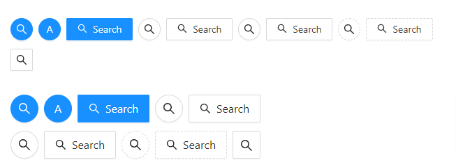
5. Vue 3 ant design buttons component small, default and large size.
Vue
<template>
 <a-radio-group v-model:value="size">
  <a-radio-button value="large">Large</a-radio-button>
  <a-radio-button value="default">Default</a-radio-button>
  <a-radio-button value="small">Small</a-radio-button>
 </a-radio-group>
 <br />
 <br />
 <a-button type="primary" :size="size">Primary</a-button>
 <a-button :size="size">Normal</a-button>
 <a-button type="dashed" :size="size">Dashed</a-button>
 <a-button danger :size="size">Danger</a-button>
 <a-button type="link" :size="size">Link</a-button>
 <br />
 <a-button type="primary" :size="size">
  <template #icon>
   <DownloadOutlined />
  </template>
 </a-button>
 <a-button type="primary" shape="circle" :size="size">
  <template #icon>
   <DownloadOutlined />
  </template>
 </a-button>
 <a-button type="primary" shape="round" :size="size">
  <template #icon>
   <DownloadOutlined />
  </template>
  Download
 </a-button>
 <a-button type="primary" shape="round" :size="size">
  <template #icon>
   <DownloadOutlined />
  </template>
 </a-button>
 <a-button type="primary" :size="size">
  <template #icon>
   <DownloadOutlined />
  </template>
  Download
 </a-button>
 <br />
</template>
<script lang="ts">
import { DownloadOutlined } from '@ant-design/icons-vue';
import type { SizeType } from 'ant-design-vue/es/config-provider';
import { defineComponent, ref } from 'vue';
export default defineComponent({
 components: {
  DownloadOutlined,
 },
 setup() {
  return {
   size: ref<SizeType>('large'),
  };
 },
});
</script>
Javed sheikh
Hello there! I’m Javed Sheikh, a frontend developer with a passion for crafting seamless user experiences. With expertise in JavaScript frameworks like Vue.js, Svelte, and React, I bring creativity and innovation to every project I undertake. From building dynamic web applications to optimizing user interfaces,

